
Choosing the right house painting for your Singapore home is more than just a decision about colours. It’s about creating an atmosphere that suits your style while remaining functional and modern. The colours you choose can entirely transform a room, influencing its mood, perception of space, and overall vibe. If you’re looking to refresh your space with modern house painting designs, you’ll find a variety of options to suit your preferences and the unique demands of Singapore’s climate.
In this article, we’ll explore some of the best house painting ideas for Singapore homes, providing expert tips and insight on how to make your space feel fresh, modern, and welcoming. Whether you’re looking to completely overhaul your home’s aesthetic or just add a touch of new colour, we’ve got the perfect inspiration for you.
Top House Painting Design Ideas for Singapore Homes
Singapore’s homes reflect a unique blend of modernity and comfort, and the house painting designs chosen by homeowners often embrace these two elements. The right colours can introduce warmth, sophistication, and elegance to any room. Regardless of whether you’re updating your interior, enhancing your exterior, or planning a commercial project, these popular painting ideas offer great versatility. Below are a few of the best house painting colours and where they can be applied:
Soft Neutral Tones – Versatile and Timeless
Soft beige, warm greys, and light whites are some of the most popular shades in house painting designs, perfect for those seeking a modern, minimalist look. These neutral colours work well in both interior and exterior applications, providing a sense of calm and balance that suits a wide range of spaces.
- Interior: Neutrals create a tranquil atmosphere and make small rooms appear larger, which is especially beneficial for Singapore’s urban apartments or homes with limited space. These shades are particularly effective in living rooms, bedrooms, and hallways, offering a clean backdrop for any style of furniture or decor.
- Exterior: Light neutral tones, such as soft whites and pale greys, are also ideal for exterior walls, as they reflect light and maintain a fresh appearance for longer periods, which is essential in Singapore’s tropical climate. Additionally, neutral tones are timeless and help maintain the home’s curb appeal, regardless of passing design trends.
- Commercial: For businesses aiming for a professional and inviting environment, soft neutral tones like beige or light grey are perfect for offices, retail spaces, and restaurants. These colours foster a calming atmosphere and allow other design elements, such as branding or furniture, to stand out.
- Maintenance Painting: If your exterior walls are starting to show signs of wear, neutral colours are an excellent choice for maintenance painting. These tones hide dirt and stains more effectively, extending the time between touch-ups.
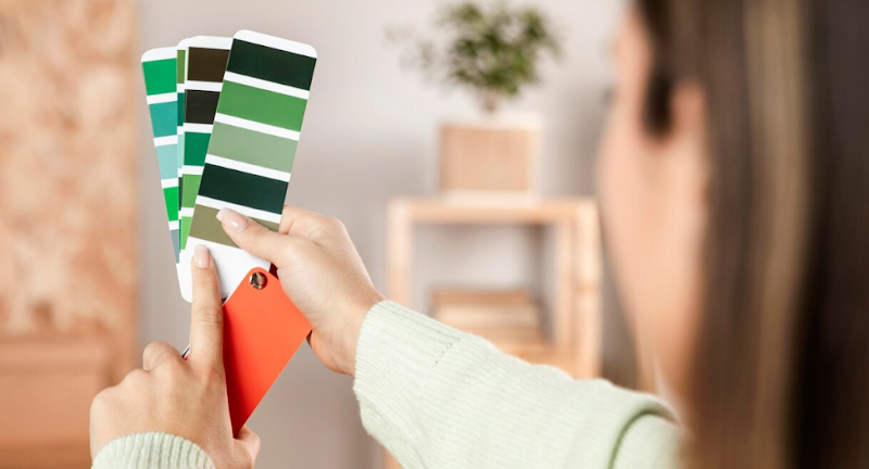
Earthy Greens – Nature-Inspired Elegance
As Singapore embraces sustainability and the importance of a green environment, earthy greens like sage green and olive have become top choices in house painting designs. These colours bring a calming, natural element to any space, making them particularly well-suited for areas where relaxation and tranquility are key.
- Interior: Earthy greens are perfect for creating serene, peaceful environments in bedrooms, living rooms, and dining areas. These colours pair beautifully with natural wood accents, textiles, and indoor plants, adding to the overall sense of warmth and nature.
- Exterior: Green shades can also be used for the exterior of homes, especially if you have a lot of surrounding greenery or garden space. Deep olive or forest green can add a classic and elegant touch to your exterior walls, making them blend harmoniously with your landscaping.
- Commercial: For businesses focusing on eco-friendliness, sustainability, or wellness, earthy greens can work wonderfully in spaces like wellness centres, eco-friendly cafes, or even retail stores selling plants or organic products.
- Maintenance Painting: Earthy greens are often chosen for maintenance painting due to their ability to hide dirt, dust, and smudges, particularly on exteriors exposed to the elements. They also hold up well in Singapore’s humid weather.
Soft Blues and Aquas – Refreshing and Relaxing
Inspired by Singapore’s oceanic surroundings, soft blues and aquas have become increasingly popular in house painting designs for their calming and revitalising qualities. These colours work wonders in spaces where you want to feel relaxed and refreshed.
- Interior: Soft blues and aquas are ideal for interior spaces like bathrooms, kitchens, and bedrooms. These shades create a cool, refreshing atmosphere and can make smaller spaces feel open and airy. Blue tones, in particular, are also known to have a calming effect, making them perfect for spaces dedicated to relaxation or unwinding.
- Exterior: While blue tones are more commonly used in interior spaces, they can also add a unique touch to your home’s exterior. A pastel blue or light aqua shade on the exterior walls can give your house a coastal, beachy feel—ideal for homes near water or in tropical areas like Singapore.
- Commercial: For businesses related to wellness or hospitality, such as spas or boutique hotels, soft blues and aquas create a peaceful and calming environment. These colours also work well in offices or healthcare settings, where they help promote focus and relaxation.
- Maintenance Painting: Lighter shades of blue, particularly pastel tones, are practical for maintenance painting. They maintain their freshness over time and are less likely to show dirt or imperfections compared to darker colours, especially on exterior walls.
Bold Accents with Neutral Backdrops – Adding Depth and Character
Incorporating bold accent colours, such as navy blue, deep green, or mustard yellow, with neutral backdrops is a popular trend for house painting designs. The contrast between the softer neutrals and the striking accent tones adds depth and sophistication to any room. This approach allows homeowners to express personality and style without overwhelming the space with too many bold colours.
- Interior: Accent walls in bold colours paired with neutral backdrops work well in living rooms, dining rooms, or bedrooms. For instance, a soft grey room with a deep blue or emerald green feature wall can add visual interest and a touch of luxury. This combination is perfect for creating focal points without overpowering the room’s atmosphere.
- Exterior: Bold accent colours can also be used on exterior elements such as front doors, shutters, or trim, while the primary wall colour remains neutral. A mustard yellow door against a soft white or grey facade can create a charming and welcoming first impression.
- Commercial: Businesses can use this approach in commercial painting projects to create unique and memorable spaces. Bold accents on feature walls or prominent areas within retail stores, offices, or hospitality venues can help convey a brand’s personality and create a distinctive atmosphere for customers.
- Maintenance Painting: When it comes to maintenance painting, bold accent colours are an excellent way to refresh specific areas that need attention, such as trims or exterior details, without having to repaint entire surfaces.
Popular House Painting Colours in Singapore for 2025

Warm Neutrals – A Timeless, Clean Look
Neutral tones like taupe, light greys, and off-whites have been a staple in design for years, and they continue to rise in popularity for 2025. These shades offer a timeless appeal, making them perfect for creating a sleek, modern look that never goes out of style. They provide an excellent base for decorating, as they complement a variety of furniture, flooring, and accessories.
- Versatile Appeal: These warm neutrals are particularly effective in making rooms feel larger and more open. Their subtle tones create a soothing backdrop that enhances other design elements without overwhelming them.
- Complementary Flexibility: The beauty of neutral colours lies in their ability to blend effortlessly with both bold accents and minimalistic décor. Whether you’re pairing taupe with gold accents or light grey with contemporary furniture, these colours can easily accommodate different interior design preferences.
- Timeless Aesthetic: With their ability to stand the test of time, warm neutrals are perfect for homeowners looking for a lasting and clean aesthetic. The balance these colours bring to your home ensures your space always feels fresh and modern.
- Durability: In maintenance painting, neutral tones help hide dirt and marks, making them a practical option for areas that receive heavy foot traffic, such as hallways or kitchens.
Soft Blues and Cool Tones – Fresh and Soothing
Soft blues and cool tones are inspired by the calming qualities of water, making them a top choice for 2025. These colours bring a sense of tranquillity and refreshment to your home, making them perfect for creating a serene and inviting atmosphere. Soft blues, in particular, are increasingly popular for spaces that aim to evoke calm and comfort.
- Airy and Inviting: Soft blue tones bring a light and airy feel to any room, making them particularly effective in spaces like bedrooms and living rooms. The cooler hues promote relaxation and are known to have a calming effect, ideal for areas where you want to unwind after a busy day.
- A Breath of Fresh Air: These shades create a natural flow of energy throughout the room, brightening up the space and making it feel open and welcoming. Blue tones also pair beautifully with natural light, enhancing the feeling of space.
- Sophistication in Simplicity: When combined with white trim or subtle wood accents, soft blues can create a refined yet simple aesthetic that is both timeless and sophisticated.
- Versatility in Themes: Whether you’re aiming for a coastal vibe or a more modern minimalist design, soft blues work seamlessly across various themes. From seaside-inspired interiors to modern urban spaces, these colours make an excellent choice for a variety of decorating styles.
Blush Pink and Terracotta – Warm and Inviting
Blush pink and terracotta are making a strong comeback in 2025, offering a fresh and warm alternative to the cooler, more neutral tones seen in the past. These earthy hues infuse spaces with warmth and comfort, making them ideal for creating a welcoming, cosy atmosphere in your home.
- Creating a Warm Ambiance: Blush pink brings a delicate, soft warmth to any room, perfect for creating an intimate atmosphere. Terracotta, with its rich, earthy tones, adds depth and character, making it ideal for spaces like living rooms, bedrooms, and dining areas where a sense of comfort is important.
- Natural and Earthy Feel: Both of these colours evoke the natural world, with blush pink reminiscent of soft sunsets and terracotta bringing to mind warm, rustic environments. Together, they create a grounded, organic vibe that works beautifully with wooden furniture, natural fabrics, and minimalistic décor.
- Pairing with Neutrals: These colours work exceptionally well when paired with neutral tones like light grey or beige. This balance allows the warm tones to stand out while maintaining a serene and uncluttered environment.
- Effective in Small or Large Spaces: Whether you’re working with a cosy flat or a spacious open-plan living area, blush pink and terracotta can adapt to both small and large spaces. These tones are effective in creating a homely, inviting environment that encourages relaxation and social interaction.
Charcoal and Navy – Bold and Luxurious
Charcoal grey and navy blue are perfect choices for those who want to add a bold, dramatic flair to their homes. These darker tones bring sophistication, depth, and a sense of luxury to any room. They work well as accent colours or as the primary choice for creating a statement wall.
- Sophisticated Depth: Charcoal grey offers a modern, sleek look with its deep, almost-black hue, adding drama and elegance to any room. Navy blue, on the other hand, adds richness and regality to spaces. Both colours bring a luxurious feel that is both timeless and bold.
- Creating a Focal Point: When used as accent colours, charcoal and navy can transform a room by creating a focal point that draws the eye. A navy blue accent wall can become the centrepiece of your living room or dining area, providing a striking contrast against lighter furnishings.
- Pairing with Metallics: Charcoal and navy look particularly stunning when paired with metallic accents like gold, brass, or copper. These metallic finishes add a touch of glamour and sophistication, elevating the space to a whole new level.
- Dramatic Contrast: These colours can also be used to create a dramatic contrast with softer hues. For example, a charcoal-grey feature wall can enhance the brightness of surrounding light colours, while a navy feature wall can be paired with crisp whites or creams to add depth and visual interest.
Why Choose Athena Best Painting for Your House Painting Services in Singapore?

When it comes to concrete spalling repair, it’s essential to hire professionals who understand both the technical aspects of concrete work and the importance of maintaining your home’s appearance. At Athena Best Painting, we are a reputable provider of house painting services in Singapore, offering both painting ideas and expert painting solutions that complement repairs like fixing concrete spalling.
- Skilled Team: Our team consists of professional painters who are experienced in providing high-quality house painting services.
- Comprehensive Services: We offer more than just house painting—we can assist in preparing the surface for paint after the concrete is repaired, ensuring a flawless finish.
- Customer-Centered Approach: We prioritise customer satisfaction, making sure the final result is exactly what you envisioned.
Our team works efficiently to minimise disruption to your daily life, ensuring that your house painting project is completed on time and within budget. If you’re planning a simple touch-up or a complete overhaul, you can rely on Athena Best Painting to deliver top-quality results.
Choosing the Best House Painting Colours for Your Singapore Home
When it comes to selecting the right house painting design, there are a few key factors to consider. Not every colour will work in every room, so it’s important to keep in mind the size, lighting, and function of each space.
- Room Size: Lighter colours such as soft whites and pastels work best in smaller rooms as they make the space feel bigger and brighter. Darker tones, on the other hand, can make larger rooms feel more intimate and cosy.
- Lighting: The amount of natural light a room receives can dramatically affect how a paint colour appears. In spaces with abundant natural light, you can experiment with darker or bolder hues, while in rooms with less light, lighter shades help brighten the space.
- Room Function: Consider the purpose of the room when selecting a colour. For example, calm, soothing shades like soft greens and blues work well in bedrooms and bathrooms, while lively tones like orange and yellow can add energy to kitchens or dining areas.
Revamp Your Home with Athena Best Painting’s Professional House Painting Services
When you’re ready to refresh your Singapore home, Athena Best Painting is here to help. Our professional house painting services will not only transform the look of your home but also ensure it stands the test of time. Whether you’re aiming for a modern, minimalist design or a bold, vibrant statement, we have the expertise to bring your vision to life.
Contact us today to schedule a consultation with our team. We’ll help you choose the perfect house painting colours that align with your personal style and the unique characteristics of your home.