
Choosing the right house painting design for each room in your home is an exciting yet essential task. It’s not simply about picking a colour off the shelf; it’s about creating a space that complements its function, your personal style, and enhances the overall atmosphere.
You’re redesigning your living room, bedroom, or kitchen, choosing the right house painting design can make all the difference. In this guide, we’ll walk you through selecting the best design for each room in your home, offering tips based on my extensive experience as an interior painter.
Athena Best Painting Services: Expertise in House Painting Design and Colour Selection
When it comes to choosing house painting designs and colours, there’s no substitute for professional advice and execution. At Athena Best Painting Services, we’ve been helping homeowners in Singapore for years with expertly crafted painting solutions that not only enhance the aesthetics of your home but also ensure the longevity of your paintwork. We offer an extensive range of services, from helping you choose the right colours to ensuring flawless application with durable finishes.
Our team of interior painters has an eye for design and a deep understanding of the effects that different house painting designs can have on the mood and functionality of a room. We’re committed to helping you achieve a stunning look, whether you’re after a contemporary, minimalist feel or a rich, vibrant look for your walls. Here’s why you should partner with us for your next painting project:
- Tailored Recommendations Based on Room Usage Every room in your home serves a different purpose, and the paint should reflect that. Whether you’re looking to create a peaceful haven in your bedroom or an energising atmosphere in your home office, our team will guide you in selecting the best house painting designs for your needs.
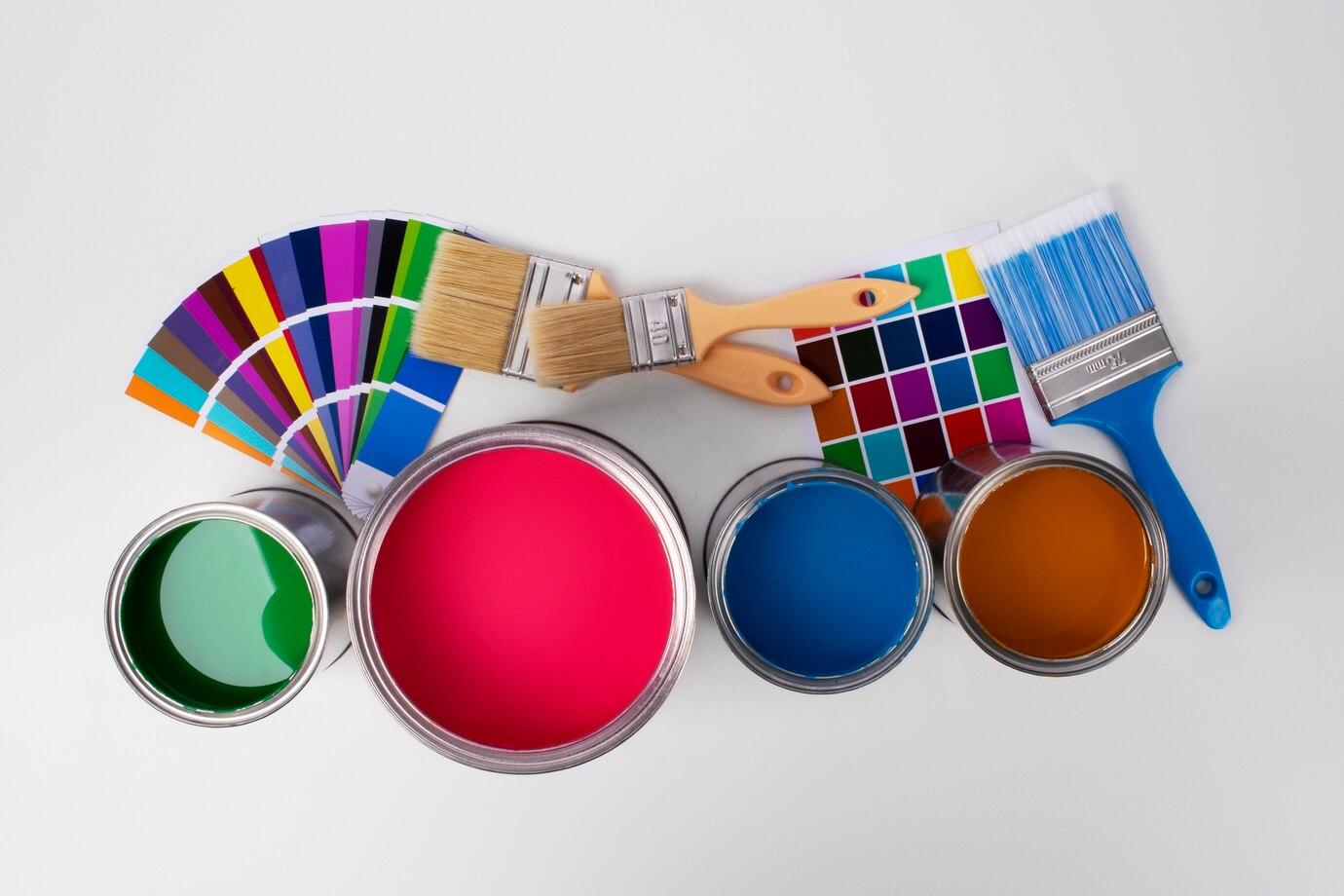
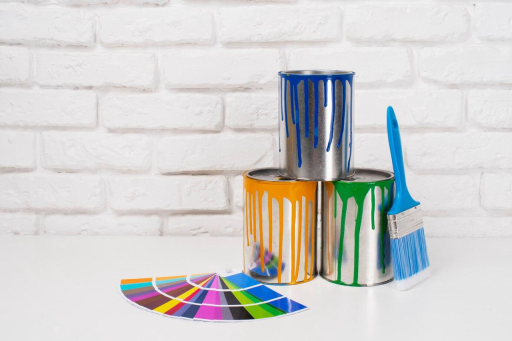
- Professional Colour Selection and Blending Choosing the right colour palette is crucial, as it can influence everything from the perception of space to the overall mood of a room. Our team helps you select shades that complement your furniture, lighting, and architectural features.
- High-Quality Paint Finishes for Long-Lasting Results We use only the best paints and tools to ensure that your house painting design not only looks great but lasts for years. Our durable finishes will withstand wear and tear, keeping your home looking fresh for much longer.
How to Choose the Best House Painting Design for Your Living Room
Consider the Room’s Functionality
The living room is often the heart of the home, where you entertain guests, relax with family, and unwind after a busy day. Therefore, the house painting design in this space should be versatile and complement its function. The first step in selecting the right house painting design is to consider the purpose of the room.
- Light, Airy Tones for a Relaxed Feel If you want to create a calm, open atmosphere, opting for light, neutral shades is often the best choice. Colours such as soft greys, off-whites, or light taupes can make a room feel larger and more inviting. These colours also work well with almost any furniture style, providing a neutral backdrop that doesn’t overpower the space.
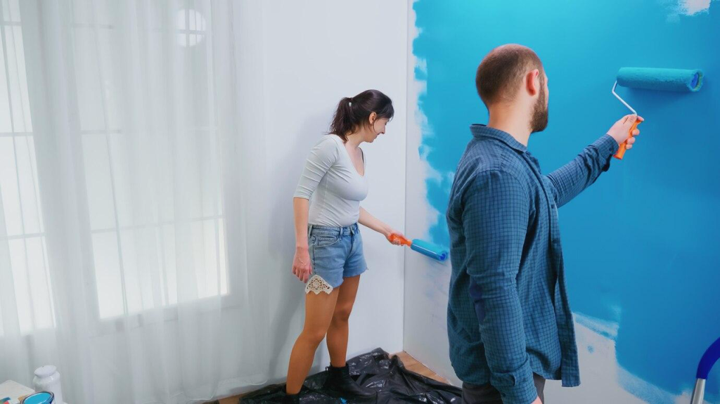
- Bold Colours to Create a Statement If your living room is a space for lively conversation or relaxing after work, bold colours like rich blues, deep greens, or even burnt oranges can create an energising environment. A strong accent colour or a feature wall painted in a bold shade can be striking and add character to your living space.
Accent Walls and Patterns
One of the most popular techniques in modern house painting design is the use of accent walls. Accent walls are painted in a different colour to the other walls, creating a focal point in the room. Whether you choose a bold colour that contrasts with the rest of the walls or a subtle, complementary hue, accent walls can create visual interest and add depth to your living room.
- Using Contrasting Colours to Create a Striking Look Consider pairing light neutral walls with a darker accent wall for contrast. For instance, pairing a soft cream wall with a rich charcoal grey accent wall creates an elegant yet dramatic effect. Contrasting colours can work especially well if you want to highlight architectural features like a fireplace or a piece of artwork.
- Popular Patterns for Modern and Classic Designs For a more creative touch, you can incorporate geometric patterns or stripes. These designs can modernise the space and add a contemporary feel. Stripes, whether vertical or horizontal, are a great option if you want to make a room feel taller or wider, depending on your preferences.
Choosing the Right Finish for Longevity
Once you’ve settled on the house painting design, the next step is to decide on the finish. Different finishes not only affect the look of your walls but also their durability.
- Matte Finishes for a Soft, Subtle Look Matte finishes are ideal if you’re looking for a smooth, velvety look that doesn’t reflect too much light. This type of finish is perfect for walls with imperfections, as it helps to hide minor dents and scratches.
- Gloss Finishes for a Sleek, Contemporary Feel On the other hand, gloss finishes give walls a shiny, reflective surface that’s easy to clean and highly durable. This makes them ideal for high-traffic areas like living rooms, where furniture may occasionally bump against walls.
Interior Painters Guide: Choosing House Painting Designs for Your Bedrooms
Soft and Calming Colours for a Restful Environment
Your bedroom should be your sanctuary, a space where you can relax and unwind. Therefore, when selecting a house painting design for your bedroom, the focus should be on creating a tranquil and restful atmosphere.
- Soft Blues, Greens, and Neutral Tones for a Relaxing Atmosphere Soft shades of blue and green are known for their calming properties. These colours can create a serene and peaceful environment, perfect for winding down after a long day. Neutral colours like warm greys, beiges, and off-whites are also great choices, as they provide a soft, understated backdrop that promotes rest.
- How to Choose the Best Colour Palette for Restful Sleep When selecting colours for your bedroom, it’s important to avoid overly stimulating shades. Bright reds or bold yellows, for example, can be energising, which isn’t ideal for a space where relaxation is key. Instead, opt for muted tones that promote calmness and sleep.
Creating Accents and Focal Points in Bedrooms
While soft, soothing colours are great for the main walls, you can also incorporate bold accent walls or feature areas to add personality and depth to the room.
- Accent Walls and Their Effect on Space Perception If you’re working with a smaller bedroom, using a darker shade on one wall can make the room feel more intimate. Conversely, lighter tones on one wall can help to visually expand the space, making it feel larger and more open.
- Bold Colour Choices to Enhance Creativity in Children’s Rooms In children’s bedrooms, it’s often fun to experiment with more vibrant colours. Bright blues, reds, or oranges can create a playful environment that encourages creativity and energy. Adding patterns like stripes or shapes can also be a great way to bring a bit of fun to the design.
Choosing the Right Paint for Bedroom Walls
The bedroom is a personal space that requires durable paint to withstand the rigours of daily life, from the occasional bump to cleaning. Therefore, choosing a paint that is easy to maintain is important.
- Considerations for Durability and Ease of Maintenance Look for paints that are washable and resistant to staining, especially if you have young children or pets. A satin or eggshell finish is a good compromise between aesthetic appeal and practicality, offering a slight sheen that’s easy to clean but not too glossy.
The Best House Painting Design Ideas for Kitchens and Dining Rooms
Colours That Inspire Appetite and Warmth
The kitchen and dining areas are where we spend a significant amount of time, preparing and enjoying meals with loved ones. The right house painting design can greatly enhance the mood and functionality of these spaces. When selecting colours, think about the psychological impact of different tones, especially those that encourage appetite and warmth.
- Warm Tones Like Reds, Yellows, and Earth Tones Warm colours are commonly used in kitchens and dining rooms as they stimulate appetite and conversation. Reds, oranges, and yellows are classic colours for kitchens, bringing energy to the space. Earth tones like terracotta, ochre, and brown can also help create a cosy, welcoming atmosphere. These colours work particularly well in traditional or rustic kitchens, evoking a sense of warmth and comfort.
- How Colour Can Influence Mood and Conversation at the Dinner Table Colour can impact the social dynamics of a room. For instance, warmer tones encourage conversation, making them ideal for dining areas where guests gather. Conversely, cooler tones such as blues and greens are more calming and might be better suited for other areas of the home.
Practicality of Paints in Kitchens and Dining Areas
While aesthetics are important, it’s also essential to consider the practicality of paint in spaces that deal with food preparation and frequent cleaning. Kitchen walls, in particular, are exposed to moisture, oils, and splashes, which can wear down paint finishes quickly if not properly chosen.
- Selecting Washable Paints for Kitchen Walls and Backsplashes A washable paint finish is essential in the kitchen, where spills and splatters are inevitable. Look for paints specifically designed for high-traffic areas that offer both durability and ease of cleaning. Satin and semi-gloss finishes are ideal choices for kitchens because they provide a shiny, smooth surface that resists stains and moisture.
- The Importance of Choosing Durable, Moisture-Resistant Paints Kitchens are subject to steam, heat, and humidity, so it’s essential to choose moisture-resistant paints that can withstand these conditions. Opting for paints with mould-resistant properties can also help keep the kitchen walls looking fresh and prevent damage from moisture over time.
The Impact of Natural Light and Paint Selection
The amount of natural light in your kitchen and dining room plays a significant role in how colours appear. Light exposure can make certain colours look more vibrant, while others may appear dull.
- How Light Exposure Can Affect Paint Colours Over Time Natural light can bring out the best in certain colours but can also cause some shades to fade faster. For example, rich reds and yellows may appear even brighter in direct sunlight, while dark colours like navy or charcoal grey might become muted. If your kitchen receives a lot of natural light, consider using slightly toned-down versions of these colours to prevent over-saturation.
- Best Practices for Using Light to Your Advantage in Open Kitchen Spaces In open-plan kitchens, it’s important to use colour in a way that complements the flow of light throughout the space. Lighter colours such as soft yellows or warm neutrals can help reflect light, making the space feel larger and more open, while darker hues can create a cozier, more intimate atmosphere in smaller kitchen nooks or dining areas.
Optimising House Painting Designs for Smaller Rooms and Spaces
Light and Bright Colours to Make Spaces Feel Larger
Smaller rooms can sometimes feel cramped or claustrophobic. However, the right house painting design can visually open up these spaces, making them feel larger and more inviting. Light, airy colours can create the illusion of more space.
- Why Whites, Light Pastels, and Neutrals Are Best for Small Spaces White and pale tones like soft greys, light blues, or pastel shades are perfect for small rooms as they reflect light and make the space feel more expansive. These shades also serve as a neutral backdrop, allowing furniture and decor to take centre stage.
- How Darker Colours Can Make Small Rooms Feel More Intimate While lighter colours help create the illusion of space, darker shades can work wonders in making small rooms feel cosy and inviting. Dark blues, charcoal greys, or even deep greens can be great for creating a more intimate, relaxed space, especially in bedrooms or reading nooks.
Using Strategic Colour Placement to Create Illusions
Even within a small space, you can use strategic colour placement to create the illusion of more space or higher ceilings.
- Colour Blocking to Enhance the Perception of Space Colour blocking is an excellent way to make a statement in a small room. By painting different sections of the room in complementary colours, you can direct the eye towards certain features, adding dimension and depth. For example, you can paint the upper half of the wall a lighter colour and the lower half a deeper shade to give the room a sense of height.
- Vertical Lines to Add Height to Low-Ceilinged Rooms If you’re dealing with low ceilings, vertical stripes can be a game-changer. These lines draw the eye upwards, making the room feel taller. This technique works well in areas like hallways or small living rooms where the ceilings might feel a bit too low.
How to Match House Painting Designs with Your Home’s Architectural Style
Each home has its own architectural style, from modern minimalist designs to traditional, cosy homes. Choosing the right house painting design that complements your home’s architecture can create a harmonious and cohesive look.
Modern vs Traditional Styles
Whether you live in a modern apartment or a vintage-style house, selecting the right house painting design that matches your home’s architecture is key to achieving a stylish interior.
- Matching House Painting Designs with Contemporary Interiors Modern homes often benefit from clean lines and minimalist design, with a focus on neutral tones, whites, greys, and subtle accents. These colours complement the sleek, sharp angles and open spaces common in modern architecture.
- Timeless Colour Choices for Classic Homes For traditional homes, you may want to consider deeper, richer colours such as soft creams, rich burgundies, or muted greens. These hues blend well with the intricate woodwork, patterned fabrics, and vintage furnishings often found in traditional homes.
Colours That Complement Your Home’s Exterior Design
Your house painting design should not only match the interior but also complement the exterior of your home. Harmonising both spaces creates a fluid and cohesive atmosphere.
- Harmonising Exterior and Interior Paint Colours for a Seamless Flow When selecting interior colours, consider how they will look from the outside. For instance, a warm-toned exterior could be paired with lighter, complementary tones inside, creating an inviting flow between the two spaces.
- The Effect of Warm and Cool Tones on Exterior Facades Cool tones, like blues or greys, work well on contemporary or coastal-style exteriors, while warm tones like yellows, reds, or terracotta are ideal for Mediterranean or traditional homes.
Innovative Techniques for House Painting Design: Faux Finishes and Beyond
Using Faux Finishes to Add Texture and Depth
Faux finishes are a great way to add personality and texture to your walls without the need for bold colour choices. If you want your house painting design to have an extra dimension, consider incorporating a faux finish. These techniques can create dramatic effects that mimic natural materials such as stone, wood, or metal.
- The Use of Sponging, Rag Rolling, and Glazing for Dramatic Effects Sponging and rag rolling techniques involve using a sponge or rag to apply a glaze over a base coat, creating textured effects that resemble natural materials. These finishes are especially effective in living rooms, dining areas, or feature walls, providing a sophisticated and tactile look.
- How Faux Finishes Work in Living Areas Versus Bathrooms or Kitchens Faux finishes are best suited for living areas and feature walls, where they can make a bold statement. However, they can also work in spaces like bathrooms, provided the paint is moisture-resistant. Faux finishes in kitchens should be used sparingly, as they can require more maintenance than standard finishes.
Designing Feature Walls and Decorative Painting
Feature walls and decorative painting techniques can elevate your house painting design, creating a focal point that adds both style and interest. Add drama to your living room or bring some flair to your bedroom—these techniques are a great way to personalise your space.
- Incorporating Murals or Stencilling for Unique Interior Features Murals can transform an otherwise plain wall into a stunning visual experience. Whether you opt for a landscape, abstract design, or a vintage-style mural, it can instantly make your space feel more personalised. Stencilling is another technique that allows you to create intricate patterns or designs, offering a more affordable alternative to murals.
- Best Practices for Feature Walls to Enhance Your Space When designing a feature wall, ensure that the colour or design complements the rest of the room. Choose a wall that naturally draws the eye, such as the one behind a sofa, a bed, or a fireplace. Avoid overwhelming the space by limiting feature walls to one or two per room and using complementary tones for the surrounding walls.
Ready to Transform Your Home? Book a Free Consultation with Athena Best Painting Services Today!
Choosing the right house painting design is essential to transforming your home into a space that’s both functional and visually stunning. At Athena Best Painting Services, we’re here to help you select the perfect colours and finishes for every room, ensuring your home’s painting project is executed with precision and care. Our team of experienced interior painters will guide you through every step of the process, from colour selection to the final touches.
Book a free consultation with us today and let’s begin transforming your home with the perfect house painting design!