
Green has become an iconic choice for home interiors, symbolising tranquillity, nature, and renewal. Whether it’s the gentle mint green colour or the vibrant aquamarine colour, a thoughtfully curated green colour palette can transform your space into a haven of elegance and serenity. With this guide, homeowners, painters, and businesses alike will find inspiring ideas to embrace green in their next makeover.
Why Choose Green for Your Home Interiors?
Green, a colour synonymous with nature, vitality, and balance, has become a timeless favourite for interior spaces. Beyond its visual appeal, green offers profound psychological and practical benefits, making it a standout choice for homeowners, designers, and businesses alike. Here’s why incorporating green into your interiors is more than just a trend—it’s a thoughtful approach to enhancing the quality and ambience of your spaces.
Psychological Benefits of Green
Colours have a powerful impact on our emotions and overall mood, and green is no exception. As a hue rooted in the natural world, it evokes a sense of calm and harmony. Studies suggest that exposure to green can:
- Reduce Stress: Green tones help in calming the mind, making it perfect for spaces where relaxation is key, such as bedrooms and living rooms.
- Enhance Focus: Incorporating green in office spaces or study rooms can foster concentration and productivity, ideal for a home office setup.
- Boost Wellbeing: Green’s association with growth and renewal makes it uplifting, promoting a healthier and more positive mindset.
For homeowners seeking to create serene sanctuaries, or businesses aiming to offer tranquil environments, green remains a top choice.
Versatility Across Styles
One of green’s greatest strengths lies in its versatility. Unlike many other colours that align with specific design styles, green adapts effortlessly across various aesthetics:
- Modern Minimalism: A soft mint green colour can add a touch of freshness to minimalist interiors, creating a clean and uncluttered vibe.
- Classic Elegance: Deep greens like emerald or olive exude sophistication, pairing beautifully with ornate furnishings or vintage decor.
- Boho-Chic and Eclectic Spaces: Earthy green tones, such as sage or moss, blend seamlessly with natural materials like rattan, bamboo, and reclaimed wood.
Whether you’re revamping a single room or reimagining your entire home, green provides an adaptable foundation that enhances any design vision.
Adaptability for Any Space
Green’s unique ability to adapt across diverse spaces sets it apart from other colours. No matter the size, purpose, or function of the room, green can elevate it.
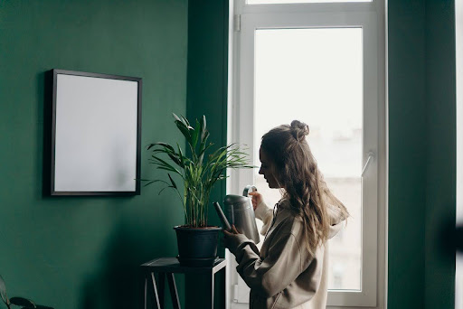
- Living Rooms: Light greens like aquamarine create airy and inviting spaces for entertaining or relaxing. Paired with neutral furniture and soft lighting, they deliver an effortless elegance.
- Bedrooms: Shades such as sage or mint green offer a calming influence, encouraging restful sleep and relaxation.
- Kitchens: Fresh, vibrant greens, like apple or lime, inject energy into kitchens, making them vibrant hubs of activity.
- Bathrooms: Cool tones, such as seafoam green, evoke a spa-like ambience, perfect for unwinding after a long day.
- Workspaces: In home offices, green promotes focus and productivity, particularly when used in feature walls or as accent colours.
Green’s adaptability ensures it aligns with the unique demands of each space, allowing homeowners and businesses to achieve their desired aesthetic and functionality.
A Colour That Resonates with Elegance and Wellbeing
Incorporating green into your home is more than an aesthetic choice—it’s a lifestyle statement. This versatile colour not only enhances visual appeal but also contributes to a sense of calm and connectedness with nature. By bringing the outdoors inside, green promotes a harmonious environment where people can thrive physically and emotionally.
- Connecting with Nature: Green’s close ties to the natural world help foster a sense of groundedness, especially in urban settings where greenery might be scarce.
- Timeless Appeal: Unlike fleeting design trends, green remains a perennial favourite, ensuring that your interiors look fresh and stylish for years to come.
- Creating Impact: Whether used as a bold statement on feature walls or as a subtle accent in decor, green adds depth and character to spaces without overwhelming them.
When carefully selected and applied, green becomes more than a colour—it’s a tool to shape spaces that inspire, rejuvenate, and energise.
Exploring the Spectrum of Green
Green is a colour that offers an unparalleled diversity of shades, making it one of the most adaptable choices for interior design. Its broad spectrum ensures that there is a perfect hue to suit every mood, style, and function. Whether you are looking for something light and breezy or dark and dramatic, green has a shade that can elevate your space effortlessly.
Let’s delve deeper into the captivating shades of green and explore how each one can transform your home.
Mint Green: A Breath of Fresh Air
Mint green is synonymous with lightness and simplicity. Its soft, pastel tone radiates a calming freshness, making it a popular choice for spaces that need an uplifting touch.
- Where to Use It:
- Kitchens: Mint green is excellent for cabinets, tiles, or walls, bringing a clean and airy feel.
- Bathrooms: Paired with white fixtures, it creates a spa-like ambience.
- Bedrooms: Its soothing effect makes it perfect for headboards or accent walls.
- Pairing Suggestions:
- Works beautifully with light woods, whites, and metallic accents like gold or rose gold.
- Add soft textiles, like beige or cream linens, for a cohesive look.
- Why It Works:
Mint green’s subtle vibrancy brings brightness without overwhelming a room, making it ideal for smaller or darker spaces.
Aquamarine Colour: Coastal Sophistication
Aquamarine, with its hints of blue, evokes the serenity of the sea. It’s vibrant enough to make a statement but retains a refined and sophisticated charm.
- Where to Use It:
- Living Rooms: Create a refreshing, open space with aquamarine-painted walls or furniture.
- Dining Rooms: A feature wall in aquamarine can make a bold and elegant impression.
- Offices: This shade’s energy and clarity promote focus, making it a great choice for workspaces.
- Pairing Suggestions:
- Combine with sandy beige or crisp white for a beach-inspired look.
- Accent with navy blue or silver for a touch of modernity.
- Why It Works:
Aquamarine’s balance of vibrancy and subtlety makes it versatile, working equally well in minimalist or eclectic settings.
Olive Green: Earthy and Inviting

Olive green offers a warm, organic feel, connecting interiors with the natural world. Its earthy undertones make it perfect for creating cosy and intimate spaces.
- Where to Use It:
- Living Rooms: Use olive green as a primary wall colour to anchor a room in comfort and warmth.
- Study Rooms: Ideal for creating a grounded, distraction-free environment.
- Kitchens: Paired with wooden cabinetry, it brings a rustic, farmhouse charm.
- Pairing Suggestions:
- Combine with terracotta, tan, or burnt orange for a rich, earthy palette.
- Add black or dark wood accents for contrast and sophistication.
- Why It Works:
Olive green’s understated elegance is perfect for those who want a timeless, grounded look that feels both modern and classic.
Emerald Green: Luxurious and Dramatic
Emerald green is a bold, opulent shade that instantly adds a sense of drama and grandeur to any space. Its jewel-like quality makes it a favourite for creating luxurious interiors.
- Where to Use It:
- Bedrooms: A striking emerald green accent wall creates a plush, regal atmosphere.
- Dining Rooms: Use as a backdrop for elegant furniture or art pieces to elevate the dining experience.
- Bathrooms: Emerald green tiles or vanities bring high-end sophistication.
- Pairing Suggestions:
- Combine with metallics like gold or brass for a luxurious touch.
- Add rich textures like velvet, leather, or silk for depth and contrast.
- Why It Works:
Emerald green’s vibrancy adds a bold and confident personality to spaces, ensuring they stand out while maintaining a sense of refinement.
Sage Green: Timeless Serenity
Sage green is one of the most versatile shades, offering a subtle, calming hue that works well in contemporary and traditional designs. Its muted tone makes it easy to blend with various styles and materials.
- Where to Use It:
- Bedrooms: Sage green walls or bed linens create a tranquil retreat.
- Living Rooms: Pair with light furnishings for a bright, airy vibe or darker pieces for a cosy setting.
- Kitchens: Sage green cabinets are a growing trend, adding charm and personality to the space.
- Pairing Suggestions:
- Combine with soft greys, whites, or muted yellows for a harmonious palette.
- Natural materials like stone, jute, and bamboo complement sage green beautifully.
- Why It Works:
Sage green’s adaptability ensures it remains stylish regardless of changing trends, making it a safe yet striking choice for any space.
Incorporating Green into Your Space
The beauty of the green spectrum is that it offers limitless possibilities for personalisation. Here are some general tips for working with green hues in your interiors:
- Experiment with Contrasts: Pair bold greens like emerald or aquamarine with softer tones for balance.
- Layer Shades: Use different shades of green in one room to add depth and texture.
- Play with Lighting: The appearance of green can vary greatly depending on lighting, so test your chosen shade in both natural and artificial light before committing.
- Use as Accents: If painting walls feels too bold, start with green furniture, accessories, or artwork to introduce the colour subtly.
A Customisable Palette for Every Personality
The versatility of green lies not only in its aesthetic appeal but also in its ability to reflect the personality and preferences of those who inhabit the space.
- Minimalists might lean toward soft greens like mint or sage for their understated elegance.
- Bold Designers could opt for emerald or aquamarine for impactful, eye-catching interiors.
- Nature Enthusiasts will find solace in earthy tones like olive green.
By understanding the unique qualities of each shade, you can create interiors that resonate with your personal style while enhancing the functionality and mood of the room.
A Thoughtful Choice for Your Next Makeover
By choosing green for your interiors, you’re embracing a colour that offers much more than aesthetic value. Green promotes wellness, encourages creativity, and adapts seamlessly to any space or design style.
Whether it’s the soft tranquillity of mint green colour or the bold vibrancy of aquamarine colour, green enables you to create an environment that reflects your personality and aspirations.
Let green be the cornerstone of your next home makeover—a colour that elevates the ordinary and nurtures the extraordinary. Visit Athena Best Painting Services for expert guidance and access to a comprehensive paint colour chart to help you make the perfect choice.
Popular Green Shades for a Stylish Makeover
When choosing the perfect shade of green, understanding your space’s needs is key. Here are some popular options:
- Mint Green: Soft and refreshing, this shade adds a light and airy feel, perfect for kitchens or bathrooms.
- Aquamarine: A bolder option, ideal for statement walls or to complement modern decor.
- Olive Green: Earthy and sophisticated, perfect for creating a warm and inviting living room.
- Emerald Green: A dramatic and luxurious choice for accent walls or formal dining spaces.
- Sage Green: Subtle and timeless, often used in bedrooms for its calming qualities.
A detailed paint colour chart can guide you in visualising these shades and their applications.
Designing with a Green Colour Palette: Tips and Tricks

A green colour palette offers an incredible range of design possibilities, from tranquil and earthy to bold and dynamic. While its versatility is a major advantage, integrating green successfully into your home requires thoughtful planning and execution.
Whether you’re aiming for a subtle refresh or a dramatic transformation, the following tips will guide you in creating spaces that harmonise beauty and functionality.
Pair Green with Neutral Tones
Neutral tones like beige, white, and grey serve as the perfect companions to green, offering balance and sophistication.
- Why It Works:
Green is a powerful colour that can dominate a space if not balanced properly. Neutrals act as a grounding force, softening the overall look and making green more approachable. - Design Ideas:
- Use a soft sage green on the walls and pair it with crisp white trim and furniture for a clean, airy look.
- Combine olive green accents with grey sofas or beige carpets for a subtle yet elegant appearance.
- In bedrooms, mint green walls with white bed linens create a soothing and inviting atmosphere.
By pairing green with neutral tones, you can achieve a timeless aesthetic that feels calm and welcoming.
Add Contrasts for Impact
If you’re looking to make a bold statement, incorporating contrasting colours can elevate your green palette to new heights.
- Why It Works:
Contrasting colours like gold, navy blue, or burnt orange add depth and drama to green-based designs. These shades provide a visual pop that prevents the space from feeling monotonous. - Design Ideas:
- Pair emerald green walls with navy blue furniture for a striking, luxurious look.
- Add gold accents—like picture frames, lamps, or hardware—to a mint green kitchen or living room for a touch of glamour.
- Use burnt orange cushions or a vibrant rug to complement olive green walls in a warm, earthy living room.
This approach is ideal for creating visually dynamic spaces that leave a lasting impression.
Incorporate Textures and Materials
Green’s connection to nature makes it a perfect partner for organic textures and materials like wood, stone, and wicker. These elements enhance the natural vibe of the colour palette while adding dimension and warmth to your interiors.
- Why It Works:
Green naturally evokes feelings of being outdoors. Pairing it with raw, natural textures reinforces this connection, creating a cohesive and inviting environment. - Design Ideas:
- Pair sage green walls with wooden furniture and woven baskets for a rustic yet modern aesthetic.
- Use olive green paint on cabinetry and pair it with a stone backsplash for a kitchen that feels both natural and sophisticated.
- Add wicker or rattan light fixtures and furniture to a room with aquamarine walls for a coastal-inspired look.
Combining green with organic materials ensures your design feels grounded and timeless.
Create Feature Walls
Feature walls are an excellent way to introduce green without overwhelming the entire space. By painting one wall in a bold shade, you create a focal point that adds interest and depth.
- Why It Works:
Feature walls allow you to experiment with vibrant or dark greens without committing to painting an entire room. They also draw attention to architectural details or specific areas in a room. - Design Ideas:
- In a living room, use emerald green on a fireplace wall to create a dramatic centrepiece.
- In a bedroom, paint the wall behind the bed in aquamarine to frame the headboard and add a calming backdrop.
- For a dining room, choose olive green for one wall and pair it with neutral tableware and furniture.
Feature walls work well in both large and small spaces, offering flexibility and creative freedom.
Balance Green with Complementary Colours
Complementary colours can amplify the beauty of green while creating harmony in the space. When used thoughtfully, colours like peach, lavender, or light pink can bring out the best in your green palette.
- Why It Works:
These colours sit opposite green on the colour wheel, ensuring a balance of energy and calm. They also add a touch of playfulness or sophistication, depending on the shade. - Design Ideas:
- Pair mint green walls with peach curtains for a cheerful, inviting living room.
- Add lavender throw pillows to a sage green sofa for a soft, elegant touch.
- Use pink or coral artwork against olive green walls for a contemporary vibe.
The key to success lies in moderation—use complementary colours as accents to keep the overall design cohesive.
Experiment with Patterns and Prints
Adding patterns and prints is an excellent way to infuse character into your green colour palette. Stripes, florals, or geometric designs can enhance visual interest and tie different elements together.
- Why It Works:
Patterns create rhythm and movement, breaking up large expanses of colour and adding layers of complexity to your design. - Design Ideas:
- Use striped cushions in shades of green and white for a fresh and summery feel.
- Choose floral wallpaper with green accents for a vintage-inspired bedroom or study.
- Incorporate geometric rugs in shades of green and beige for a modern twist.
Patterns are a versatile tool that allows you to customise your design while keeping it visually engaging.
Consider the Role of Lighting
Lighting plays a crucial role in how green appears in your home. Different types of lighting can alter the way green tones are perceived, so it’s essential to test your chosen shade in various conditions.
- Why It Works:
Green is a highly responsive colour that changes with the quality and intensity of light. Understanding this dynamic can help you make the most of your palette. - Design Ideas:
- In rooms with plenty of natural light, use lighter greens like mint or aquamarine to enhance the brightness.
- For spaces with dimmer lighting, opt for deeper shades like olive or emerald to create a cosy atmosphere.
- Use warm lighting to bring out the richness of green tones, or cool lighting for a fresher, more modern effect.
Always test paint samples under your room’s lighting conditions before making a final decision.
The Importance of Quality Products and Expert Advice
While green is versatile, achieving the perfect look depends on using high-quality products and seeking professional guidance. Visiting a paint shop near me can provide valuable insights into choosing the right shade, finish, and tools for your project.
- Professionals can recommend the best green tones for your specific lighting and decor.
- They can guide you on selecting finishes—matte, satin, or glossy—that work best for your chosen shade.
- You’ll have access to comprehensive paint colour charts that help you visualise the possibilities.
Investing in expert advice ensures that your green colour palette not only looks stunning but also stands the test of time.
Designing with a green colour palette is an opportunity to blend creativity with timeless elegance. Whether you’re pairing green with neutrals, adding bold contrasts, or experimenting with textures and patterns, the possibilities are endless.
By incorporating thoughtful design elements and seeking professional support, you can transform your home into a sanctuary of style and serenity. Start your journey by visiting a paint shop near me or consulting Athena Best Painting Services for quality products and expert guidance. Let green redefine your space and bring your design dreams to life.
The Role of Lighting in Enhancing Green Shades
Lighting significantly influences how green tones appear:
- Natural Light: Enhances brighter greens like mint and aquamarine, adding a lively atmosphere.
- Artificial Light: Soft lighting complements darker shades such as olive or emerald, creating a cosy and intimate setting.
Experiment with different light sources to achieve the desired mood in your space.
Choosing the Right Finish for Green Paint
The paint finish you choose plays a vital role in the overall look:
- Matte Finish: Perfect for creating a soft and muted appearance.
- Glossy Finish: Adds a reflective quality, making small spaces appear larger.
- Satin Finish: Balances durability and elegance, ideal for high-traffic areas.
Explore Athena Best Painting Services’ paint colour chart to find the ideal finish for your chosen shade.
Eco-Friendly Green Paint Options
Incorporating sustainability into your home makeover has never been easier. Athena Best Painting Services offers:
- Low-VOC Paints: Minimising harmful emissions without compromising on quality.
- Eco-Conscious Choices: Paints crafted with the environment in mind, suitable for health-conscious families and businesses.
Going green extends beyond the colour—it’s about making mindful decisions for a better future.
Green Accents: Beyond Walls
Think beyond traditional wall applications by incorporating green in creative ways:
- Ceilings: A bold green ceiling can add a dramatic flair to your space.
- Furniture: Cabinets, chairs, or shelving painted in green create subtle yet striking accents.
- Accessories: Cushions, curtains, and rugs in green tones can complement and balance the overall palette.
These ideas allow you to embrace green while maintaining a cohesive aesthetic.
Athena Best Painting Services: Your Partner for Stunning Interiors
Transforming your home with a stunning green colour palette is effortless with Athena Best Painting Services. Here’s how we can help:
- Expert Consultation: Our team assists you in selecting the perfect shade, whether it’s mint green colour, aquamarine colour, or others.
- Comprehensive Paint Colour Chart: Explore a wide range of colours and finishes tailored to your needs.
- Quality Products and Services: We ensure superior results with premium-quality paints and professional execution.
Bring your dream interiors to life. Contact Athena Best Painting Services today to get started.