
When it comes to maximising space in Singapore apartments, house painting designs and colours are essential. The right choice of colours can not only enhance the aesthetics of your home but also influence the perceived size of a room. Small apartments, which are common in Singapore, can often feel cramped, but a strategic paint job can completely transform them, making them appear more spacious, airy, and inviting.
In this article, we will explore the best house painting designs and colours specifically suited for apartments in Singapore. We’ll provide expert tips and ideas from professional interior painters, helping you make the most of every inch of your living space.
1. Choosing Light Colours to Maximise Space
One of the most effective ways to make your apartment feel more spacious is through the strategic use of house painting designs and colours. Lighter tones such as whites, greys, and pastels reflect both natural and artificial light, making a room feel open and airy. This is especially beneficial for smaller apartments, as these colours enhance brightness and contribute to a sense of space.
Why Light Colours Work: Light hues reflect light, allowing it to bounce off walls and fill the room. This amplification of light brightens the space, making it appear larger. Sunlight filtering through large windows or artificial lighting benefits from light colours, contributing to an expansive feel in even the smallest rooms. A carefully chosen house painting design can elevate the space, especially in smaller apartments.
Choosing the Right Shade: Selecting the right house painting design and colours is key to creating a fresh, spacious atmosphere. Soft whites, light greys, and pastels like pale blue, mint green, or soft peach are excellent choices. These painting ideas help promote tranquillity and openness, making them perfect for all types of living spaces. In apartments where space is often limited, using these light shades can create a cohesive, clean look that makes rooms feel open and inviting.
Extending Light Colours Beyond the Walls: To further enhance the spacious feel, consider using light colours on ceilings, doors, and trim. This technique promotes the feeling of height and openness, making the entire space feel coordinated. In apartments with large windows or bright views, light colours complement natural light, further enhancing the expansive effect.
- Layering Light with Texture: While light colours are key to maximising space, layering them with different textures adds depth. Consider using soft velvet cushions or matte wall finishes. This introduces visual interest and a sophisticated atmosphere without compromising the openness of the room. The guidance of interior painters can help you choose the right textures and finishes to maintain an open, spacious look.
2. Using Accent Walls to Add Depth Without Cluttering the Space
Accent walls are a powerful house painting design and colour technique that can create a focal point in a room while preserving the overall sense of space. This approach involves painting one wall a bold, deeper colour, which draws attention and adds visual depth without overwhelming the room’s flow or compact feel. Used correctly, accent walls in small apartments can enhance the space’s design and add a sense of dimension.
- Choosing the Right Wall for an Accent: When deciding on the ideal wall for an accent colour, the location plays a crucial role. The wall opposite the entrance or the focal point of the room is typically the best place for an accent wall.
This placement ensures that the feature wall is immediately noticeable but does not interfere with the room’s functionality or flow. In living rooms, for example, the wall behind the sofa is often a natural choice for an accent colour. In bedrooms, the wall behind the bed works well, as it creates a sense of intimacy and focus.
- Popular Accent Colours: Darker, richer colours tend to work best for accent walls in small spaces. Colours like deep blue, charcoal grey, forest green, or even earthy tones like olive green and terracotta can add sophistication and warmth to a room.
These shades create a sense of depth, drawing the eye towards the accent wall and giving the room a more layered and dimensional feel. Choosing a colour that contrasts with the lighter tones used in the rest of the room helps create a striking visual effect that doesn’t overwhelm the space.
Balancing Accent Walls with Lighter Tones: While accent walls are a great way to introduce bold colours, it’s important to balance them with lighter hues on the remaining walls. Keeping the surrounding walls in neutral or light shades like white, soft grey, or light beige allows the accent wall to stand out without making the room feel too closed in. This contrast ensures that the space still feels open and bright, with the accent wall serving as a bold, yet tasteful, focal point.
- When to Avoid Overuse of Accent Walls: While accent walls can add character, it’s important not to overuse them, especially in very small rooms. One well-placed accent wall is typically enough to add interest and depth to a space without making it feel smaller.
Too many accent walls can clutter the visual flow of the room, leading to a disjointed, less open feel. Therefore, it’s essential to keep the rest of the room in complementary light colours, ensuring a harmonious and spacious look.
3. The Power of Monochromatic Colour Schemes
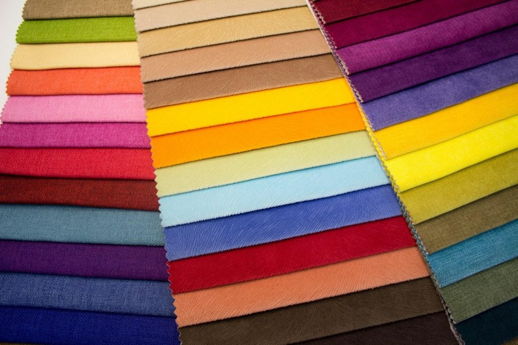
A monochromatic colour scheme uses different shades, tints, and tones of a single hue to create a visually harmonious and unified look. This approach is particularly effective in smaller rooms, where the goal is to create an uninterrupted flow of space.
Instead of using a variety of contrasting colours, a monochromatic scheme keeps everything within one colour family, making the room feel more open and cohesive. Sticking to a single colour palette helps eliminate visual distractions, ensuring the focus remains on the overall aesthetic and feel of the space.
- How to Implement Monochromatic Design: To achieve a balanced and soothing look with a monochromatic colour scheme, it’s important to stick to one colour family—such as varying shades of grey, blue, beige, or green. These colours can be layered through different tones and depths to create dimension within the space.
For example, if you choose blue as your base colour, you can use a pale blue on the walls, a deeper blue for the upholstery, and a soft, muted navy for accent pieces. The key is to vary the saturation and lightness of the colour, preventing the room from looking flat while maintaining a consistent, harmonious theme. These painting ideas work well for smaller spaces, where you want a sense of continuity and calm.
- Textures and Materials in Monochromatic Design: The beauty of a monochromatic colour scheme lies not only in the variations of the colour but also in how it interacts with textures and materials. You can introduce different textures to add visual interest without disrupting the cohesion.
For instance, a matte finish on the walls paired with a glossy finish on furniture or decor creates a subtle contrast that adds depth to the room. Soft velvet cushions or linen curtains can introduce a luxurious texture, while a sleek leather sofa can add sophistication.
These tactile differences ensure that the room doesn’t feel monotonous or bland, even though the colour palette remains consistent. The advice of interior painters can help you strike the right balance in texture and tone to maintain a cohesive feel.
- Benefits of a Monochromatic Scheme: One of the main advantages of using a monochromatic colour scheme is that it prevents the space from feeling too busy or cluttered. In smaller apartments, where every square foot counts, visual clutter can make a room feel cramped and disorganised.
A monochromatic approach helps to visually “open up” the space, making it appear more expansive than it really is. The consistent use of one colour gives the room a sense of continuity, making it feel more integrated and less fragmented. This is especially important in apartment living, where limited space demands a cohesive house painting design and colour to maintain a sense of calm and order.
- Creating an Airy, Unified Atmosphere: Monochromatic colour schemes are ideal for creating a serene and airy atmosphere in small apartments. The lack of stark colour contrasts allows the eye to move smoothly from one area to the next without interruption.
This results in a relaxed, peaceful feeling throughout the space, which is particularly valuable when dealing with small living areas that can often feel busy or overwhelming. By eliminating bold contrasts and focusing on subtle variations within a single colour, a monochromatic design can create a room that feels larger, lighter, and more open.
- Maximising Flow and Continuity in Small Spaces: Monochromatic schemes are particularly effective for creating a sense of flow and continuity, which is essential in smaller apartments. This house painting design allows the space to feel uninterrupted and expansive, as the colours do not jar or distract from one area to the next.
In a small apartment, this seamless transition from one room to another can create a cohesive living experience. Using shades of grey for a modern look or varying tones of warm beige for a more rustic feel ensures the consistent colour palette unites the entire apartment, making each room feel part of a greater whole.
- Experimenting with Monochromatic Elements: One of the most appealing aspects of a monochromatic colour scheme is its versatility. While the colour palette remains consistent, you can experiment with different design elements to further personalise the space. For example, you can incorporate furniture, artwork, or accessories in complementary tones or textures.
A deep charcoal accent wall, paired with a series of light grey furniture pieces, creates a subtle yet striking contrast that gives the room depth while maintaining the unity of the overall design. In a monochromatic room, you can be bold with your design choices—such as introducing patterned wallpaper or geometric textures—while still ensuring everything blends together smoothly.
4. Maximising Natural Light with Your Paint Choices
Natural light is one of the most effective tools to make an apartment feel more spacious. It creates an open, airy atmosphere, essential in small spaces. However, to maximise natural light, the right house painting design and colour is key. Colours can either enhance or hinder the light reflected in the room. By selecting the right painting ideas that work in harmony with natural light, you can transform your space into one that feels expansive, fresh, and inviting.
How Colours Affect Natural Light: Natural light changes throughout the day, and the colours on your walls can either accentuate or diminish the sunlight. In rooms with ample sunlight, opt for cooler tones like soft blues, pale greys, and light greens to balance the warmth. These shades enhance the openness and spacious feel, particularly in living areas or bedrooms where a calm atmosphere is desired.
- In rooms with less natural light, such as interior rooms with few windows or darker corners of the apartment, it’s essential to use paint colours that amplify available light. Lighter, warmer tones like soft beige, off-white, or light ivory brighten a room significantly.
These colours bounce light around, making the space feel larger and more welcoming. Soft neutrals, like cream or light taupe, also improve the flow of light, contributing to a warm, inviting atmosphere.
- Reflective Paints and Finishes: Another way to maximise natural light in your home is through reflective paints or finishes. These paints are designed to amplify the light by reflecting it back into the room. In spaces with limited light, using reflective or glossy finishes, such as satin or semi-gloss, helps bounce light around, creating the illusion of more space.
These finishes are especially effective in kitchens, bathrooms, and small living areas where every bit of light counts. The sheen from a satin or semi-gloss finish reflects both natural and artificial light, brightening the space and enhancing openness.
- White and Light Greys for Maximum Brightness: White is an ideal choice for maximising natural light. It reflects the most light, creating an expansive and airy atmosphere. Light greys, off-whites, and soft beiges also achieve a similar effect. These house painting designs and colours make rooms feel brighter and more open, even in areas with minimal sunlight.
If your apartment doesn’t get much natural light, choose lighter colours for the walls to make the most of what’s available. White and light greys also work well in modern interiors, creating a sleek, minimalist look that complements various furniture and décor styles.
- Balancing Natural and Artificial Light: In spaces where natural light is limited, balancing it with artificial lighting is crucial. Consider layering your lighting options with overhead lights, floor lamps, and task lighting.
This will help make up for the lack of sunlight, ensuring the space feels well-lit day and night. Choosing house painting designs and colours that complement artificial light, such as warm whites or soft neutrals, prevents the room from feeling too harsh or cold when natural light isn’t available.
5. Room-Specific Painting Ideas for Maximum Space Efficiency
Each room in your apartment serves a unique function, and the house painting designs and colour you choose should complement the purpose and layout of the space. Customising your painting ideas for each room will help create the illusion of more space, while enhancing both the aesthetics and functionality of the areas. Here’s how you can apply house painting designs to specific rooms to maximise space efficiency:
Living Room: Creating a Calm and Open Feel
The living room is often the focal point of any apartment, where family gatherings and relaxation take place. For this space, using light neutral colours is essential to make the room feel more open and airy. Opt for shades such as soft whites, pale greys, or light beige to create a calm, welcoming environment. These light tones reflect natural light, making the living room feel brighter and more spacious.
Adding Depth with an Accent Wall: If you want to add some visual interest and depth to the living room, consider using an accent wall in a deeper shade. Darker colours like charcoal grey, deep blue, or olive green can make the room feel more dynamic without making it feel smaller. A feature wall behind the sofa or on the wall with the TV will create a focal point and enhance the feeling of depth.
For Larger Living Rooms: In larger living rooms, you can introduce bolder tones to create distinct areas within the space. For example, a reading nook could be painted in a slightly darker shade, while the rest of the room remains in lighter, neutral tones. This helps define different zones, like a seating area and a workspace, while maintaining the openness and flow of the space.
- Incorporating Open Shelving or Light-Coloured Furniture: Use open shelving or light-coloured furniture in the living room to complement the house painting design. This helps maintain a sense of openness and ensures the space doesn’t feel crowded, even when filled with furniture.
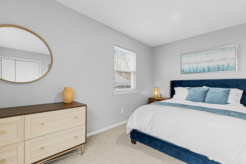
Bedroom: Soft Tones for a Relaxing, Spacious Atmosphere
The bedroom should be a peaceful retreat where you can unwind and rest. To make the room feel more expansive and relaxing, soft, calming colours are essential. Light shades like soft blue, lavender, or pale green can help create a tranquil atmosphere while also making the space feel larger.
The Importance of Light Colours: Lighter colours in the bedroom promote a serene and spacious environment. Opting for pale shades of blue or lavender helps to establish a calming mood, perfect for sleep and relaxation. Additionally, light colours can make smaller bedrooms appear more open and airy.
- Encouraging Relaxation and Openness: The key to a spacious bedroom is ensuring the colours enhance relaxation. Stick to a lighter colour palette for walls, with accent pieces in slightly deeper tones to add contrast and sophistication. Avoid heavy, dark colours that may make the space feel cramped or gloomy.
- Maximising Vertical Space: To further enhance the feeling of space, paint the ceiling in a light colour or use vertical lines in the room’s design. This draws the eye upward, making the room feel taller and more expansive.
Kitchen and Dining: Bright and Inviting Spaces
The kitchen and dining area are functional spaces where cooking and meals take place. To maintain a clean, open, and welcoming feel, light colours are ideal. Shades like soft whites, light greys, and pale yellows are perfect for these areas, helping to reflect light and make the space feel brighter and more inviting.
Maximising Brightness: In kitchens, especially those with limited natural light, it’s essential to use colours that enhance the brightness of the room. White or off-white paint can help illuminate the space, making it feel fresh and clean. Additionally, light shades can make the kitchen feel more spacious, even in compact apartments.
Creating a Welcoming Dining Area: In the dining area, using light, neutral colours will create a warm and inviting atmosphere for meals. Pair the light tones with accents of wood or metallic finishes in furniture and décor to add warmth and texture, while still keeping the space feeling open and airy.
Incorporating Reflective Surfaces and Glossy Finishes: To further maximise brightness, consider using reflective surfaces or glossy finishes in the kitchen and dining area. These finishes reflect light, making the space feel larger and brighter. Glossy tiles or shiny countertops, for example, complement light painting designs and enhance the feeling of openness.
Bathroom: Light and Reflective Colours for a Spacious Look
Bathrooms are often the smallest rooms in an apartment, but they can still feel spacious with the right house painting design and colour. The key to maximising space in a bathroom is to use light colours with reflective finishes. These colours help bounce the available light around the room, making it feel brighter and larger.
Using Light Shades: Light colours such as soft whites, pale blues, and light greys are perfect for creating the illusion of a more expansive bathroom. These shades make the room feel clean and fresh. Avoid darker colours, as they can make the space feel cramped and closed off.
- Glossy Finishes to Reflect Light: For bathrooms, choosing a glossy or semi-gloss finish on the walls will further enhance the sense of space. These reflective finishes help bounce light around the room, creating the illusion of a larger, brighter space. A shiny finish can also protect the walls from moisture, which is crucial in a bathroom.
- Adding Mirrors and Light-Coloured Fixtures: To complement the reflective paint finishes, consider adding mirrors and light-coloured fixtures. Mirrors can amplify the effect of natural and artificial light, creating a sense of openness.
Light-coloured bathroom fixtures, such as sinks, countertops, and storage units, will harmonise with the house painting design and contribute to a brighter, more spacious atmosphere.
How Athena Best Painting Can Help You Create a Spacious Feel
At Athena Best Painting, we are committed to transforming your apartment into a more spacious, stylish, and welcoming home. Our team of experienced interior painters uses the latest techniques and highest-quality paints to ensure that your house painting design and colour enhances the aesthetics and functionality of your space.We understand the challenges of working with small apartments in Singapore, and we pride ourselves on providing custom solutions that optimise every inch of your living space. If you are looking to create a bold, modern look or a soft, tranquil environment, our expert team will guide you through every step of the process. Contact us today to start transforming your space into something truly special.